Illustration with Jamie Edler
Hey Jamie! You’re an illustrator based in North East London. I would say your work has a painterly and dreamlike quality to it, would you agree with that characterisation? What are the main differences between your work now and your work say, 10 years ago?
Cheers, my dears! I think I’ve often been drawn to a mixture of painterly and graphic qualities in my work. I often work quite intuitively with composition and colour and my mam often describes me as away with the fairies (pun intended lol) and I think that often feeds its way into my work.
My work is an escape for me – it’s one of the few times my ADD settles down and I tend to zone out. The softness and ethereal quality, I think comes from an idealised way that I’d like to see the world in aha, as cheesy as it sounds.
I have to admit, ten years ago I was doing my art GCSE, so I can safely say that my work has changed a lot, as I’ve grown and discovered myself more. I remember, my art teacher really didn’t rate my work (saying that it was, ironically, too illustrative). She told me I wasn’t going to pass! To which, I responded by getting the head of art to mark it instead, which proved much more on my side haha. Gotta make the system work for ya haha
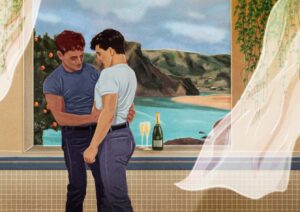
Some of your art contains queer imagery and male eroticism – subject matter that can still, in 2021, receive a negative response. Have you always had the confidence to show this side of yourself in your work? Are there other artists and creatives who inspired you to display your sexuality in your art? What advice would you give someone wanting to work with similar themes, who lacked the confidence to do so?
Last year, I had some pretty crappy experiences on the street in direct relation to my sexuality and identity, but in terms of my work I’ve mostly had lovely responses from people. These experiences definitely pushed me to continue to try to start conversations within my work about social issues and make them approachable and accessible without being intimidating and accusatory. Conversation and debate is always better than arguments and hate (I might coin this).
I think, in part because I stray into the currently slightly less covered grounds of imagery and topics in some of my pieces – looking at intimacy and sensuality rather than overt eroticism and sex, I’ve had a positive response from a broad variety of people, from different parts of the world with different backgrounds, which I love. I think it’s important to look at our heterosexual peers producing similar work and it’s quite clear that a straight male artist including the female form in a similar way to I do the male in my work, isn’t branded with it intrinsically linked to their artistic identity and sexuality in the same way LGBTQ+ members of creative community are. Whether I like it or not, because I draw men within my work and I am queer, it is intrinsically linked to being labelled a queer artist and the many things that come with this label, both positive and negative. I’m an artist first and foremost and personally I don’t feel like I need the label queer before my job title to validate my work. I don’t feel like it has to a part of my professional identity. I often feel that myself, like many others are often painted with one brush because of our more evocative pieces, but they aren’t the only pieces that make up my portfolio
I would say rather than presenting just my own sexuality, I present an alternative to the heteronormative one seen in most aspects of society.
I think when I first started freelancing professionally, I was very conscious of being branded as a queer artist – and then the potential problems I felt might come with that; that you would only be considered for commissions and briefs within that realm for instance. But as time has gone on and I’ve become more confident in my work in general, I think I’ve found a balance. As I mentioned earlier, my portfolio isn’t just hunky lads (although there are a lot of them, I’ll admit) so I think knowing that I showcase my other skills and interests in my body of work made me feel more confident in showing the more sensual and queer side of my work.
I think sexuality and sensuality in art has always been such a common theme throughout art history – whether covertly or unabashedly; and certainly, the artists that I’m drawn too, are ones that I feel do this beautifully. Edward Hopper, Henry Scott Tuke, David Hockney are just some examples that spring to mind. In terms of advice for people, I think it’s about knowing when you feel ready to show that side of you, which can be quite a personal and intimate thing for people to do. You have to be prepared for people’s assumptions and negative judgements and not allow them to make you forget why you’re creating that work in the first place – because it’s a part of yourself and of life that you want to champion and celebrate. And the end of the day, you can’t make everybody happy and some people love to spread negativity but you’re doing it for yourself first and foremost, so let them bitch.
Do you think it’s important for artists to place a deeper meaning or a message in their work? Can you give an example of a piece of artwork that moved you in a way beyond the aesthetic?
Sure if they want to. But I don’t think there should be an expectation or an onus on an artist to provide a deeper meaning or an explanation for that said meaning. The most exciting thing about artistry is that everyone can have a different perspective and interpretation of it. And sometimes, as a creative, an image I create is simply that. A pretty image. Sometimes, I’ll return to an image I create and think, ‘oh I didn’t realise at the time, but this is why I drew that or this is why I used those colours’. I think often, for myself at least, a lot of subconscious messages find their way into my work. I used blues for a month because I was feeling melancholic or I drew a lot of swimming pools because I’m a little scared of water. Or I drew mountains, because that’s where I felt happiest and most exhilarated. But alongside this, it doesn’t necessarily matter what meaning I intentionally into pieces, the audience will also view it as separate entity with their own interpretations. I’d say 70% of a piece is the artist presentation and goal, the rest what the audience see and make it into. Hopper’s work in general, moves me beyond the aesthetics and composition, because he creates a sense of both intimacy and loneliness at the same time. There is a stillness in his work that is intriguing and comforting whilst at the same time, slightly unsettling and thought-provoking.
These are themes that I’m interested in within my own work – the unspoken or unheard conversations, the light touch of a hand on someones leg, the curiosity in the mundane. You can be one of a hundred people in a room (who am I referencing here?!) and still feel alone and I enjoy trying to encapsulate that feeling within my work with intimacy, humour and vibrancy for life told through a warm and slow moving narrative.
What would you like to offer up as your WFTP hidden gem?
Printer of Dreams is a printer in Homerton, which is run by a real gem of a chap, I recommend them to all of my illustrator friends.
Plus find an Oxfam bookshop in an area where people with a lot more money than you do live and you can find some real beauties usually haha. My go-to is Crouch End, and I’ve found some really stunning art books for like a fiver.
Cheers Jamie, it’s been great to hear about your work. Please give us your links and social media channels so we can follow what you do!

Interview by Alex Wilson